Story Behind Wingdings
If you’re in school during the ‘90s to the aughts, you’ve probably played a lot with the fonts in Microsoft Word. Finding the perfect font for a school project or assignment is the fun part of doing them.
For instance, if you want a creepy, Halloween-y font, you use “Chiller.” If you’re feeling funky and fun, you go for “Jokerman.” If you have a report about ancient history, you choose “Papyrus.” If you want to create a play set in the Middle Ages, you pick “Old English Text.”
But “Wingdings” seemed to be the odd one you never deem useful. Why? Because it’s all symbols, no letters. You might have wondered why it has been made and do people really use it. Here’s where you can find out.
Wingdings’ History with Dingbats
The history of Wingdings ties back to the start of printing. Originally, printing was a manual process that existed before typing. It involved setting every letter, character, word, line on every page individually and manually. It was a long and tedious process.
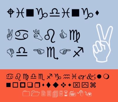
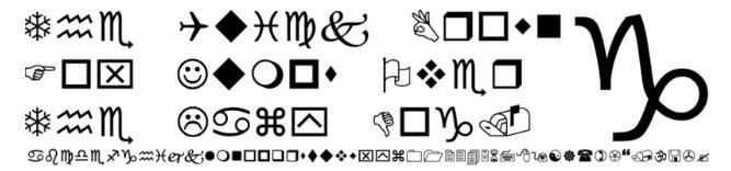
Therefore, setting a fancy text was a complicated process. Creating templates for fonts was expensive and laborious, so printers invented a shortcut: dingbats. Dingbats were reusable sets of special characters, symbols, and glyphs arranged in ornamental pieces to decorate, or frame printed pages. The trick was to slot plain text in a dingbat instead of hand-carving and laying out every ornament.
The use of digital dingbats was motivated by the same reason why they were initially created – to save some time. Just as early printers wanted to save time using dingbats, the new generation of computer typographers saved time using dingbat fonts.
During the ‘70s, the predecessor of the Wingdings fonts was created: Zapf Dingbats. It’s a digital dingbat font designed by prolific calligrapher Hermann Zapf.
The creators of Wingdings, husband and wife team Charles Bigelow and Kris Holmes, were Zapf’s protégés. The duo was inspired to create their own digital dingbat fonts, namely the Lucida Icons, Lucida Arrows, and Lucida Stars, after gaining success with the Lucida type family they initially created.
The inspiration for these dingbat fonts was diverse. It included elements that spanned several eras – from the gestures used by Ancient Romans to the ‘90s office hardware. Some symbols were more direct, like the ornamental ones inspired by the flowers in Bigelow’s garden.
Bigelow and Holmes’ dingbat fonts became more widely known than their teacher’s Zapf Dingbats when Microsoft bought the rights to use all three fonts: Lucida Stars, Icons, and Arrows. Microsoft chose their favorite symbols and assembled them in a single font in 1992 and called it Wingdings.
The name Wingdings, given by Microsoft, combines the words “Windows” and “Dingbats.” The font was included in a beta version of Windows, and it has been ever since.
The Purpose of Wingdings
The primary purpose of Wingdings is to make it easier to integrate images into documents at a time when copying and pasting from the Internet wasn’t viable yet. In the 90s, image files were too large for the puny little hard drives and simple HDs of computers at the time. Nowadays, getting images from the Internet would take only a few megabytes of data, which is nothing compared to the size of the computer’s memory. But in the ‘90s, there were few ways to acquire images, as search engines weren’t well-developed yet for commercial use (and many weren’t even invented yet until the late ‘90s).
Even if someone received images, the floppy disks weren’t big enough to support it. If you can jam it in, the picture must have a poor resolution; meaning, it won’t look great with the text.
Therefore, Wingdings offered an alternative solution to use icons in high resolution that could be resized and can blend in an uncomplicated way with the text. Since it’s a font, it won’t take lots of memory space like images.
The Wingdings font can also be considered as an offline predecessor of the emoji – an integral and ever-present part of modern communication. Wingdings had access to better software and electronic communication, making a faster way to express ideas when needed. As a result, designers came up with more symbols and icons. Then, emojis were later experimented with by designers, who thought that it would be great if there were cartoon faces to communicate emotions.
The Controversy about Wingdings
Wingdings wasn’t intended to be typed. You may just need to memorize what key you need to press to get a certain icon or simply use the “insert symbols” function. But Wingdings has been confusing people ever since it was created.
In 1992, the New York Post insinuated that the font contained anti-Semitic messages against the Jewish community in New York because typing “NYC” would result in a skull with crossbones, followed by a star of David and a thumbs up. This sparked some conspiracy theories that the font contained subliminal messages, suggesting that this was a symbol of approval for the killing of Jews in New York.
Microsoft denied these allegations and assured that it was just a coincidence. But the company took the controversy seriously. In the later-released Webdings font, they carefully chose the symbols that would accompany each character. If you type “NYC” in Webdings, you’ll get an eye, heart, and a city skyline – which reads “I Love New York” in code.
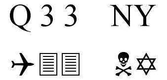
Another conspiracy theory following Wingdings appeared after the 9/11 attacks. Some people conspired that the creators of Wingdings had already known about the attacks. Entering the sequence Q33 NY in Wingdings – alleging that Q33 was the flight number of the first plane to hit the World Trade Center – will result in a plane followed by two rectangular paper sheet icons (which can symbolize skyscrapers), then the skull symbol and the star of David.
Microsoft also debunked the controversy by claiming that it was purely coincidental, and it was confirmed later on that none of the flight numbers of the planes involved in the attacks were Q33.
While these conspiracy theories proved to be nothing but theories, they consecrated Wingdings as part of pop culture.
Takeaway
Wingdings added geekiness to electronic communication. It has become one of the most recognizable fonts ever. This pop-culture phenomenon of a font is considered to be the grandfather of modern emoticons and the center of curious coincidence that inspired conspiracy theories. Who would have thought that the bizarre font from Microsoft Word has a fascinating past and an influence on today’s culture?