Do Wingdings Have a Purpose?
If you’ve spent a lot of time with Microsoft Word, you’ve probably encountered Wingdings on the font choices. But this font is made entirely out of symbols – you can’t read it as it is. It surely seems bizarre, like it was a code. What are the creators of the font thinking? Why would anyone think we want to write a period using a mailbox? Why would anyone compose sentences using astrological signs and boxes?
What is Wingdings?
Before answering those questions, let’s get to know Wingdings better first.
The Wingdings font family was developed in 1990 by Kris Holmes and Charles Bigelow. Originally, the fonts were named Arrows, Lucida Icons, and Stars to complement the Lucida text font family by the same designers. In 1992, they renamed, reorganized, and released it as Microsoft Wingdings. The three fonts offer a harmoniously designed set of icons representing the elements of graphical user interfaces and personal computer systems.
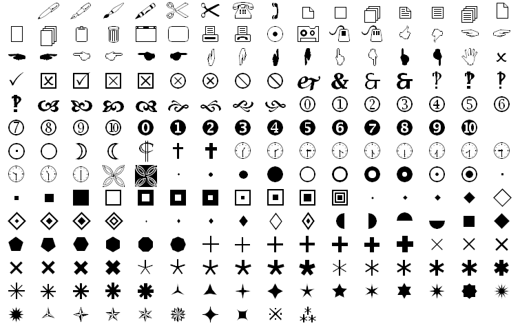
In Wingdings, letters are rendered as a variety of symbols using dingbat fonts. There are icons for a monitor, PC keyboard, trackball, mouse, diskette, hard drive, printer, tape cassette, fax, etc., as well as other icons for file folders, mail, documents, windows, mailboxes, windows, clipboard, and wastebasket.
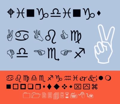
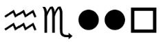
In addition to that, Wingdings also include icons that have significance both on traditional and computer sense, like writing tools and hands, clipping scissors, bell, reading glasses, checkboxes, bombs, and some more traditional images like astrological signs, weather signs, and religious symbols.
Other random things you can find in Wingdings fonts include:
- Encircled numerals
- Ampersands and interrobangs
- Elegant flowers and flourishes
- Pointing hands
- Arrows in different gradations of weight
- Directions
- Bullets
- Asterisks
- Ornaments
- Squares
- Polygons
- Geometric circles
- Targets
- Stars
These symbols became part of Wingdings because images from historical and modern sources influenced the creators. The Lucida Icons, for example, spanned many eras. It contains hands and pointing fingers that go back to medieval manuscripts; airplanes were 20th-century inventions; and computers, keyboards, mice, and printers included in the fonts were part of office life in the ‘90s.
The floral elements in Wingdings were partly inspired by the flowers in Bigelow and Holmes’ garden in the summer they designed the font. Other floral elements were inspired by English roses, Renaissance paintings, and other foliage.
This goes to show that Wingdings goes back not just to the digital era but from hundreds of years before that.
What Is the Purpose of Wingdings?
For an observer, Wingdings looks like a quirky font with randomness put together just to make a “font.” In the early 90s, Wingdings was one of the first times that people realized fonts could break through to the mainstream. It marked one of the first times a font became part of pop culture.
As a means of writing sentences, it surely fails, but it was never its purpose. It was like emojis, but even more useful. Today, it’s easy to cut and paste images from the Internet, but in the 90s, it used to be a lot harder. There were a few ways to download images. Files were too large to store for undersized hard drives – plus, they’re often of poor quality. Also, it was hard to get pictures to play nicely with the text. Fonts like Wingdings gave them a workaround by giving people a way to add high-quality, scalable images that won’t clog up their hard drives.
History of Wingdings
Husband-and-wife team Charles Bigelow and Kris Holmes made Wingdings happen. These two were the designers of the font family Lucida, making them pioneers for crafting font types suited to the digital era. They were protégés of legendary designers Herman Zapf, creator of Zapf Dingbats font, which is another collection of odd symbols. Zapf Dingbats broke ground when it was distributed with Apple Printers during the mid-80s.
Lucida put Bigelow and Holmes in the frontline of digital-type designers. To be complete, their font needed some complementary characters that worked well with letters, so they designed Wingdings in 1990.
Originally, they were three separate fonts named Lucida Arrows, Lucida Icons, and Lucida Stars, until the fonts that became Wingdings were made to harmonize with text. The font is made with similar proportions to Lucida.
With Wingdings, users can simply pick the appropriate icon by typing the letter assigned to it to adorn, animate and add illustrations to their documents without worrying about file size and quality.
Bigelow and Holmes experienced a breakthrough soon after creating the fonts when Microsoft bought the rights to Lucida Arrows, Lucida Icons, and Lucida Stars in 1990 and combined its favorites to a single font called “Wingdings.” It was included in Windows’ beta test that year. Storage size limited the number of characters Microsoft could include, as it was already including so many fonts in its floppy disc release. But despite the limitations in technology, a cultural phenomenon was born.
The name “Wingdings” combines the old printing term “dingbat” with “Windows.” The new name has an added connotation of wildness and excitement. From the start, it became a hit – thanks to Microsoft including it in its ecosystem. This made Wingdings more popular and known by average computer users than Zapf Dingbats and other competitors.
If you’re not familiar with dingbats, here’s what it is: they are tiny pieces of reusable shapes used in printing presses that can be slotted into text and used as ornamentation in a book. Before computers and modern printers, every figure or letter had to be hand-carved and laid out before anything could be printed. Making a new template for every figure or drawing was too laborious, so dingbats became handy.
The same way a user of the Wingdings font might add in a mailbox while asking for an RSVP, an analog printer used a dingbat to add some flair to the page.
Where does the name “dingbats” come from? Nobody knows for sure. Lots of printing terms started as a colloquial thing, but Bigelow notes a possible origin: the Dutch word “dingus,” which means “thing.” It may also be an onomatopoeic word, like the sound of a piece of a metal type falling to the floor.