Is Creating a New Font Difficult?
There are tons of high-quality fonts available online – both free and paid – that can be used in any design project. Many editing apps come with lots of pre-loaded fonts.
However, there are times when you need a custom font to really make the design unique. If that’s the case, you’re probably wondering if there are tools you can use to create your own font and if it’s a difficult thing to do.
Is Creating a Font Difficult?
Whether free or from a font pack, every digital font goes through the same design process. It can be hard for a beginner, and it will require a basic understanding of foundational principles in typography. But for what it’s work, learning how to create your own font from scratch is one of the most fulfilling activities when it comes to digital design. Designing fonts professionally may take years to master, but once you understand the steps necessary to create a font, you may be surprised at how easily they can be replicated.
Creating a font is like creating a puzzle. You have an idea of the end product, but attempting to get what you want to create can be hard. Sometimes, you create a few shapes for your characters, and they look great together, but then you draw another character, and you realize you need to go back and change the others to make them all work together. Every little move or stroke influences everything else.
At first, you have to define a style. If you want something truly unique, you need to make sure not to copy any fonts, especially notable ones. This part may be a challenge in itself. And once you have decided on a style, it may take you anywhere from a few minutes to a few hours to design every character.
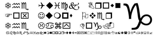
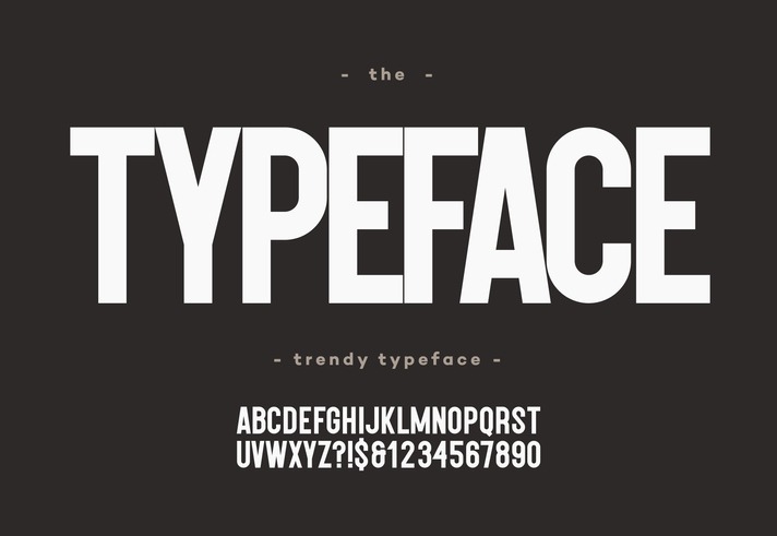
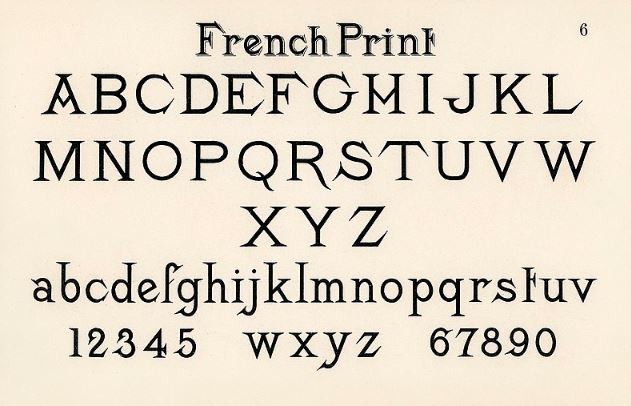
To start, you have 26 uppercase letters. Each of the letters must fit the style you want to define. Then, proceed with the 26 lowercase letters – still making sure you fit the same style but still look different. You have to do the same with the numbers and extra characters like punctuation.
Like most areas of the design world, you’ll learn best by doing when it comes to type design. Creating a well-designed, masterful typeface requires years of practice, but it may only take a couple of weeks to finish your first font and learn a bit from experience.
The Basics You Need to Know
Beginners need tips for creating a new font. Here are the things you need to know to make font creation easier:
1. Fundamentals of typography
It’s essential that you understand how typography is structured before you start designing your characters. This requires knowledge of terms like baseline, x-height, cap height, ascender, and descender, as these serve as a guide for designing your characters.
It also helps to know terms like finial and ligature, but these are more useful in more advanced typefaces. When you’re just getting started, you must only need to understand how letters must be organized in a grid system.
2. Kerning and leading
Space is something you need to consider when designing your letterforms. Kerning refers to the space between individual letters in a word while leading is the space between the lines of text. Both are built into fonts, and each needs to have default metrics. If you’re new to type design, a lot of these processes are learned through trial-and-error. If it looks wrong to you, then it’s probably wrong.
In some programs, kerning and leading can be adjusted, but a decent font will build it right in. Some letters are easy to kern, such as H, I, and L, but others like A and V can be tricky. Sometimes, you have to compromise a bit with some characters or individually kern two letters.
3. Letterform sketching
A lot of professional-quality fonts include a standard character map, plus alternative typeface styles such as bold, italics, and small caps. You don’t need to provide it all, so instead, focus on the basics if you have a font in mind.
Start by designing your typeface using pencil and paper, and draw a simple baseline grid. Use a ruler to make gridlines and measure dimensions proportionally. Sometimes, you may find that you need to revise or make drastic changes to the point of starting over from scratch. Don’t be discouraged when it happens – it’s normal. Your goal is to make a final set of characters for a font that can be scanned into the computer to be digitized.
4. Moving from paper to vector
Once you’re finished sketching the letterforms, it’s time to move them to the digital realm. Scanning your work is the best way to do that, but if you don’t have a scanner, capturing them on your phone will do. You need to trace the sketches in a font design program, and you’ll adjust them to be as close to proportion as possible.
Some font designers trace their characters using a vector program like Adobe Illustrator, while others prefer to use a font creation program right away. If your goal is to make an OTF/TTF font file, then it may be easier to start tracing from a font creation program.
If your goal is to make fonts for a brand symbol or vector logo, then Illustrator is the way to go. Illustrator makes it easy to export your work into graphic file formats than font files.
5. Font creation software
There is a myriad of font creation programs you can use to make your font legit. A font creation program is important and essential to make an actual, usable font you can use for your digital designs. TTF/OTF files are generated from these programs, and they are an essential part of the workflow.
If you want to know how to create your own font for free, there are free applications available and tutorials on the Internet you can watch.