Learn About the History of Fonts
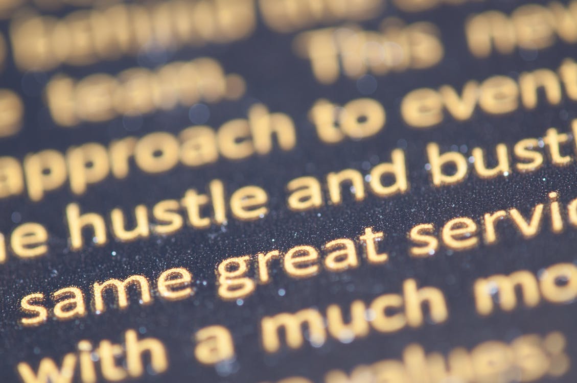
From webpages and mobile apps to billboards and magazines, different fonts surround us. Every font you see is used for a different purpose, and each one is chosen based on its unique “personality” — choosing fonts is a crucial step in the design process for anything involving text. Some fonts are better suited to professional applications, while others have a cartoony feel, and your choice of fonts can make or break any project.
But have you ever wondered where all these fonts come from? Whose idea was it to create such a range of fonts? And when did printed fonts first come into being? Read on to find out more.
Fonts or typefaces?
To the average user, the terms “font” and “typeface” may seem interchangeable, but this is far from true. At a technical level, the words have distinct meanings, although they both deal with typography.
A typeface refers to the appearance and style used for characters in a font family. A font, on the other hand, is the specific weight or stylistic variant for characters of any typeface. Originally, in the early days of printed text, a font also meant a specific point size — so 12-point Arial and 14-point Arial would be two separate fonts. With the introduction of digital printing and scalable fonts, however, this distinction is no longer relevant or useful.
Essentially, a typeface is the appearance of fonts in a specific font family, such as the Times family, while the fonts in this family include Times Roman, Times Bold, Times Italic, and so on.
The Earliest Fonts
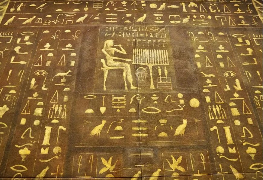
Though some believe typography to be a recent development, its history spans over several centuries, with roots as going far back as the 1400s. Johannes Gutenberg invented a new movable type and printing press in the 1440s, based on those used in East Asia in the early 11th century, and was the first to use metal for his type pieces (as opposed to porcelain). This also gave rise to the first typeface, called Blackletter. Blackletter was a dark, intense, and practical font, but it wasn’t very legible — but the first analog font was born.
In 1470, Nicolas Jenson created Roman type, inspired by the text on ancient Roman buildings. Being easier to read than Blackletter, his fonts gained popularity quickly. Roman type later led to what we now call “Old Style” serifs, which were followed by transitional, then modern, and various other serif typefaces.

Later in the 15th century, the Venetian publisher Aldus Manutius commissioned the creation of typefaces resembling human handwriting at the time. These typefaces are the earliest known precursor to today’s italic fonts and revolutionized personal reading. The italic style allowed more words to fit on a single page, causing the books published with Manutius’ press to be cheap and portable, and were the predecessor of today’s paperback books.
Enter New-age Sans-Serif
Serifs are the small lines or strokes attached to the ends of longer strokes, found in serif fonts like Times New Roman. Sans serif fonts are simply fonts that omit these short strokes. The first of these was introduced by William Caslon IV in 1816, and was not received well initially — even being dubbed “grotesque” fonts.

Despite this, newspaper publishers and store owners quickly adopted this style of font, since they were better suited to eye-catching headlines and advertisements as well as being easier to read than serif fonts. Sans serif fonts were also preferred by software developers in the 1990s due to the low resolution offered by CRT monitors, which obstructed the readability of serif fonts.
Though monitor resolutions have improved and serif fonts have been optimized for digital use, sans serif fonts remain the standard for web use today.
Modern Fonts
Today, we have access to tens of thousands of different typefaces and fonts on our computers, and the origin of these can be attributed to Lisa — the first computer with a graphical user interface, released by Apple in 1983. Steve Jobs said he learned the importance of typography when he visited Reed College’s calligraphy studio during the year he studied there. In 2005, Jobs told students at Stanford University:
“I learned about serif and sans serif typefaces, about varying the amount of space between different letter combinations, about what makes great typography great. It was beautiful, historical, artistically subtle in a way that science can’t capture, and I found it fascinating.”
-Steve Jobs
Later, when he began working on the Apple Lisa, one of Steve Jobs’ core requirements for the computer was that it had to have a range of fonts, and they had to be proportional. These fonts, designed by Susan Kare and named after cities, were bitmap fonts that each had their own personality to match their namesake cities. These, however, were later replaced by Adobe’s vector-based fonts, since they were smoother than Kare’s bitmap fonts.
Adobe’s PostScript program — a page description language that converted font information to digital display into the information needed to print smoothly — came with fonts we are more than familiar with today: Courier, Helvetica, Times, and Symbol.
When it comes to fonts made for digital display, one that is frequently mentioned is Verdana. Verdana is known for its wide proportions and loose letter spacing, as well as its tall x-height (the length of lowercase letters). These features made it easily readable on low-resolution displays as were common in 1996, when the font was released.
Final Thoughts
In today’s world, with our high-resolution displays, there is no need for carefully-designed fonts that maximize readability at small sizes. As a result, designers today are able to experiment with much more freedom than they did two decades ago, and this has given rise to a range of new font styles.
These include scripts and decorative fonts, the latter of which play around with proportions and letter shapes to create a more impactful effect. These are used everywhere from signage to logo design, and more are being created every day.